

Data visualizations are everywhere around us: on billboards, smartphones, and even our utility bills.
Our software applications make it easy for us to design dashboards and visualizations for business with no training.
And that’s the problem.
We can create dazzling displays that don’t help people make decisions or get things done.
What’s a good dashboard?A dashboard is a collection of data displays used to monitor conditions and processes or facilitate understanding so the people who use them can make well-informed decisions.
A good dashboard accomplishes those goals at the speed of visual perception. If it doesn’t do that, your people won’t want to use it. Over 50% of the human brain processes visualization, making it the fastest, most natural way to convey understanding.
The good news is that with a little knowledge and practice you can design dashboards that inspire action. The following eight principles will help you get started.
1. Understand the purpose
A dashboard for monitoring production quality will be much different from one that shows why employee turnover is causing production delays
The way the user arrives at understanding will be different in each case.
The first principle in dashboards is the same as in marketing—know your customer. Understand what your end-users need to know, what they need to accomplish, and how you can present it to them in a way they will understand.
2. Involve end-users in the design
Displaying insights requires a dashboard that shows data relevant to each role in your organization, so you need to know what matters to them. You’ll also need to show that data in a way that drives action.
Useful design starts with conversations. You’ll want to know what data your audience needs and why it matters to the business. You’ll want to know what specific data points are most relevant to the dashboard user and what decisions they will make when they see them.
Discuss requirements with the users before you design the dashboard, then sit side by side with them while they test your prototype. Let their needs and the way they work guide you.
You'll often need to repeat this cycle to fine-tune your design.
3. Keep it fresh
A display that doesn’t change for a month will be ignored. One that inspires and motivates action will create an appetite for more.
Review dashboards with members of your audience often. How often depends on how their needs change or what new data becomes available. When your analytics team develops new data, meet with your people to see how they want to use it. And when they ask for more, find a way to get it.
4. Control the scope
If you try to please a broad audience with one dashboard, you’ll probably have some dissatisfied customers. The wider your audience, the less it will meet their specific needs.
For example, marketing and sales are distinct functions, but people in these roles must often use the same dashboard, but even within the same functional group, separate roles like CMOs and SEO marketers use different data.
Dashboards should be specific to a particular functional group, level, role, and, if necessary, the individual
.jpg?width=390&name=quote%20(1).jpg)
One way to address this problem is to create dynamic or interactive dashboards, if your reporting tools provide them.
Dynamic dashboards use identity security settings to control what data individuals can access. You will need a robust identity management system to make it work.
What makes them dynamic is that users can select what charts and data they want to see.
5. Simplify displays
Dashboards often display too much information at once, putting users off before they even explore it.
A new dashboard must appear easy to use, so it should only display data that can show relevant insights.
Rather than clutter dashboards with information they might want, work with your people to address specific needs, and create stacked displays with easy navigation to explore separate topics or questions.
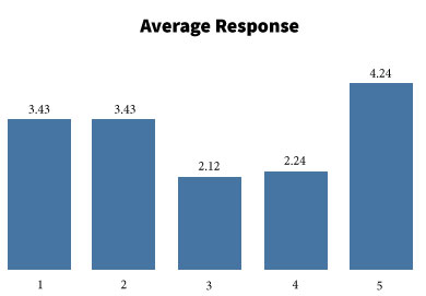
6. Choose the right chart
It's crucial to select the correct display for each purpose.
For example, a bar chart can typically provide more easy-to-understand comparisons than a doughnut or pie chart.
In the pie chart below, it’s hard to discern the relative size of the sections, but in the bar chart, it’s immediately apparent. 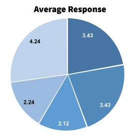
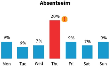
7. Highlight what’s important.
Make it obvious what needs attention. You can use symbols and colors to prompt questions.
The absenteeism chart below uses color and a familiar symbol to prompt questions about absenteeism on Thursdays.
You can use conditional formatting to highlight results that fall outside their acceptable range.
8. Facilitate the workflow.
Dashboards need to follow the natural workflow. You should supply a visual structure that helps users navigate the content, what will they see first, second, third...
Summary
Applying these tips to your dashboards will make them easier to understand and more likely to motivate action. Actionable dashboards help team members at every level make better decisions and give you a better return on your data investments.
Read more ...
Get science-based tips on how to use color in your dashboards:
6 Ways You Can Improve Data Visualization.
About Pixentia
Pixentia is a full-service technology company dedicated to helping clients solve business problems, improve the capability of their people, and achieve better results.