Introduction: Any application, in general, can be considered as complete if it is responsive. Now a days, as we are equipped with different resolutions of monitors, all users may not use monitors with similar kind of resolutions. They differ based on their work preferences. So if we design any application, it should be pretty flexible to fit in any of such resolutions.
This blog shows how to develop an MVC web application which is responsive, using Twitter Bootstrap by considering an example of uploading various kinds of files in document viewer.
Implementation:
- Create an MVC web application.
- To make the application responsive, we need to use Bootstrap.
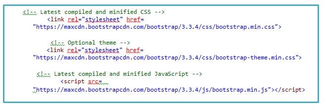
- Two ways to use Bootstrap :
Process: 1

- We can make use of classes that are present in the bootstrap files to make your UI more responsive.
- Consider a Partial View and add iframe in it, into which we will load the uploaded files.
- To make it responsive use ‘form-group col-md-12’ class for iframe.

- Add file upload control and submit button in the view to display the uploaded file in the iframe.

- Enclose the above controls in a HTML form, so that on form submit, it calls the Action Method in a controller and passes the uploaded file information as an argument to it.

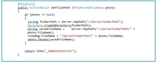
- Add the below logic in controller to save the uploaded file in the application path and give that saved path to ViewBag dynamic property which is a source for iframe.

Pixentia is an enthusiastic family of individuals, fervent to make lives simpler through effective use of technology. Our mission is to implement solutions that drives business results. Know more insights from our thoughts and experience.
Contact us today or call 1-855-978-6816 to talk with us about your business needs.


