There is no doubt about it – color and typography that we choose for a website design has a huge impact on multiple aspects of our website including readability, mood, perceived article length, user experience and much, much more. It is absolutely essential that designers know and understand about color and typography that create a pleasing design, in order to properly portray the vision and mood of the website they design. Lets start with color.
Color Matters a lot
Color represents emotional response :
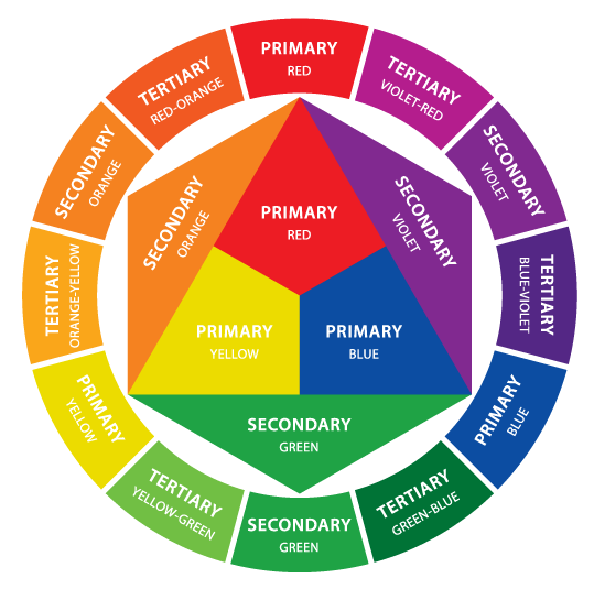
Color is the most critical visual element of most user interfaces. And that’s because color has associated meanings that create emotional responses and those emotional responses will either drive us to what is intended or it will drive us to something that was not intended. Either way you have to be aware of how the color is influencing your behavior. Everyone of us are aware of primary,secondary and tertiary colors.

Using them accordingly in our website is the important thing, let us learn some basic features about the usage of colors.
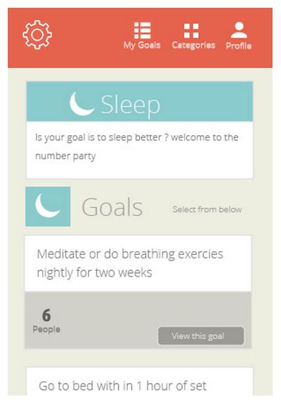
Take a look at this interface design, This is for a sleep meditation app.

Its goal is, a sort of help to make you relax and get into a meditative state so that you can sleep better.
Here, Do u see a ton of contrast ? Do u see stark (sharp) black and white colors? Do u see bright ,day glow, screaming colors? No…..
You see sort of this nice peach orangey type color with a nice tan background and baby blue. Header up here and a typeface that is sort of very friendly and welcoming and says sleep, goals. Everything is very sort of sedate and subtle, and pleasant. This shows the instance where color use is very much inline with the intended emotional response
Usage of meaningful colors ( Color conveys meaning without saying):
Color also delivers symbolic meanings that support and enhance the visual experience in the elements of a design. There is an intended idea or concept that meant to be communicated, and color goes a long way in helping reinforce that. And of course , the idea to be communicated almost goes through the meanings of colors without saying.
Red Promotes : power, importance, youth
Orange Promotes : friendliness, energy, uniqueness
Yellow Promotes : happiness, enthusiasm, antiquity (darker shades)
Green Promotes : growth, stability, financial themes, environmental themes
Blue Promotes : calm, safety, openness (lighter shades), reliability (darker shades)
Purple Promotes : luxury, romance (lighter shades), mystery (darker shades)
Black Promotes : power, edginess, sophistication
White Promotes : cleanliness, virtue, simplicity
Gray Promotes : neutrality, formality, melancholy
Beige Promotes : traits of surrounding colors
Ivory Promotes : comfort, elegance, simplicity
Evaluating proper colour use for your website :
Evaluate color in your design by asking these questions.
- Are colours used sparingly ?
- Do my colors reinforce or interfere with hierarchy and content?
- Is my color scheme used consistently?
- Is my color used functionally or it is just decorative?
- Does functionality depend on color?
Typography
Remember, the primary goal for choosing your font should be readability. Since Internet readers have little patience, you’ll want to make their experience on your site as easy and pleasant as possible.
Bold vs regular fonts:
When the information is different you use different style.
Same thing can also be done with font weight.
Bold fonts are regularly used for titles and subheadings, but they can also be used to highlight key words and phrases. But, if you start capitalizing entire sentences, your audience may feel like you’re shouting at them.
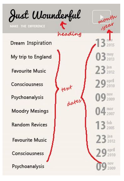
This example shows the several differences in font weight that communicate the hierarchy of information.

Heading is separate from the categories appear below. Gray subtle faint dates are associated with month and year. Here weight of font follows the hierarchy of heading, text, dates, month and year. The weight of font represents visual weight which allows us to discern between on type of information and the next.
Evaluating proper use of typography:
- Identify different types of content: headlines, body bullets, charts etc.
- Create specific styles for each : font, weight, colour.
- Apply these styles consistently on every screen
- This consistency enhances usability, increases comprehension and improves overall user experience.
Finally, experiment with color and typography! Use digital image tools such as Photoshop and try to apply different colors and typography to your images. Don’t necessarily settle on your first choice. Study websites which you think that they use colors effectively and take note of the combinations used. Being aware of color and typography and its use, will give you the confidence to create effective, aesthetically pleasing websites.
Phenomecloud is an enthusiastic family of individuals, fervent to make lives simpler through effective use of technology. Our mission is to implement solutions that drives business results. Know more insights from our thoughts and experience.
Contact us today or call 1-855-978-6816 to talk with us about your business needs.


Leave a Comment